|
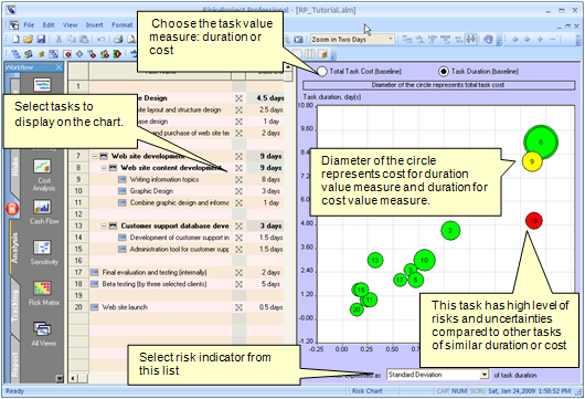
Risk Chart
The Risk chart shows risks associated with tasks versus task
duration or cost. The risk is expressed as:
• task standard deviation of task duration or cost
• maximum or minimum values
• ranges: the difference between maximum and minimum values
• percentiles
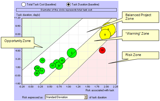
In well-balanced project schedules, different tasks usually have
similar level of risks. However, if risk associated with a task if
higher than for tasks with similar duration or cost, these risks
should be carefully analyzed and possibly mitigated. Alternatively,
if task does not have significant risks and uncertainties compared
with other similar tasks, it may be represent an opportunity to
increase the risks for and increase benefits.
Analyzing
the Risk Chart
1. Select the tasks that you want to display on the chart
from the list on the left.
2. Select the project parameter option (Total Task Cost or Task
Duration) option at the top of the chart.
3. Select a risk indicator from the Risk expressed as drop-down list.
These are standard statistical measures such as standard deviation or
percentiles.
The example below illustrates how the Risk Chart can be analyzed using
“risk zones”. If you visualize these zones on your risk chart, you
can clearly see which tasks are outliers and merit further
examination.
Note: These zones are shown here purely for
demonstration purposes and do not appear in the actual Risk Chart.
See
also
Risk Matrix
Project Summary
Sensitivity Analysis
Risk Mitigation view
|